Team Canvas:
when the signals are scattered, who pulls them back?
Where teams actually live (and the org chart misses)
When we talk about how a team is doing, the focus usually lands on the org chart, the job ladder, the monthly review deck. But most of that is after-the-fact tidy-up — not real-time signal. The truth is: what a team is actually doing is rarely visible from the org chart alone.
The actual pain point
Every week someone is shipping, some project is quietly drifting off-schedule, some system is being carried by one person, and the people listed on paper cannot be found in the actual work trail. Those signals stay scattered across chat tools, version history, and meeting notes — until someone leaves and you realize you cannot reconstruct what they were doing. The problem is not "we have no data". The problem is that no one is structuring the data into a single picture that everyone can use as a shared reference.
Structuring it, and making it visible
I started by setting up the dev-to-deploy workflow — the rules, the deliverables for every step, an internal Gitea + Runner so commits could land regularly. Everyone's in-flight work followed the branching convention and got pushed up daily. Then I pulled those technical outputs together and threaded the systems' functionality into a single dashboard. Management gets a focal point to align on; everyone else gets a reference they can come back to when the day-to-day starts to feel directionless.
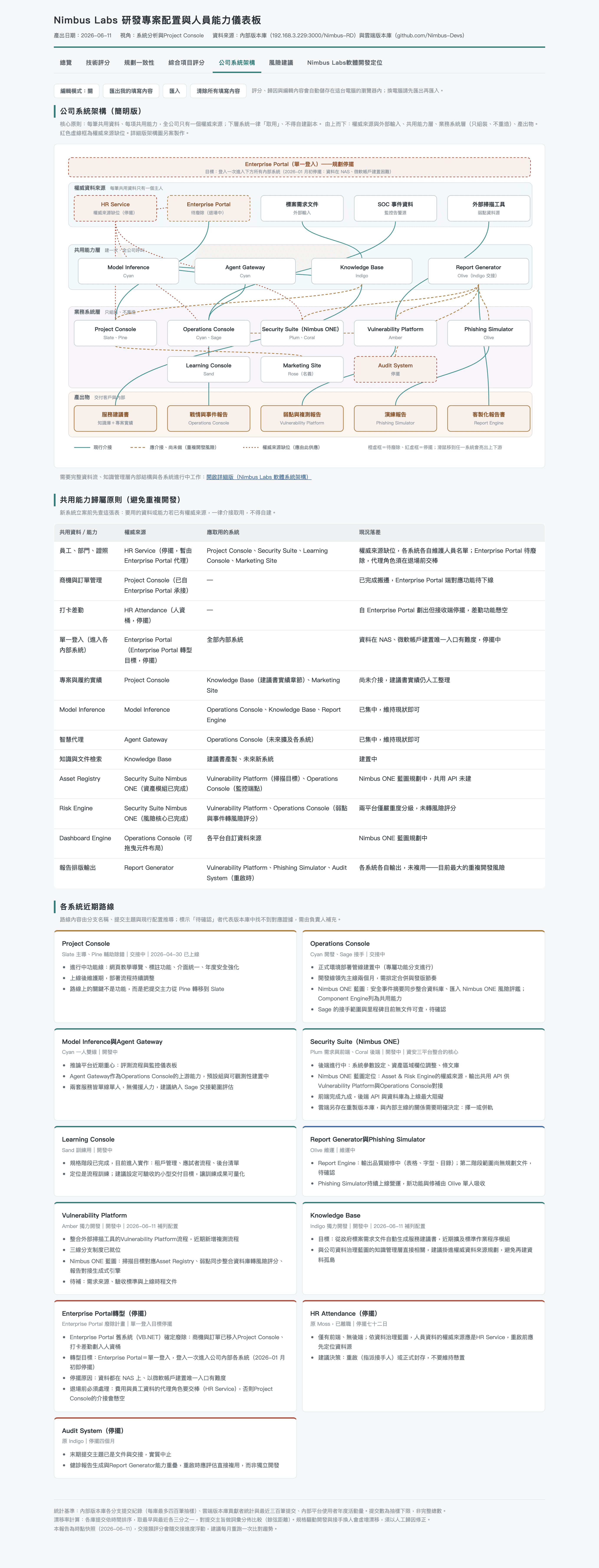
The whole org on one page — four layers, three kinds of wiring, six system states.
Four layers, top to bottom: authoritative data sources, shared capability layer, business systems, outward outputs. Three line types: solid for "already wired up", dashed for "should be connected but isn't yet", dotted red for "no clear owner of this data" — both sides claim the data is theirs, and neither of them is wrong. That last one is the most interesting — that kind of authority overlap is the biggest hidden debt an organisation builds up for itself.
The point of this picture is not that it looks good. The point is: once the whole map is in one place, the questions asked in meetings change. "Why is this product talking directly to a data source instead of going through the shared service?" "If we kill that transforming system at the top, what happens to all those dashed lines downstream?" These are the questions that only get asked once the picture is in front of everyone.
From "after-the-fact" to "real-time signal": a working mechanism, restructured
To understand what Team Canvas is doing, you only need to follow one variable: the visibility of progress and individual traits. The old way of knowing who was on track was looking at commit/push history, plus whatever the monthly review surfaced, plus asking around. Two problems with that: (1) slow — signal takes two to four weeks to surface; (2) filtered and distorted by the time it reaches anyone who can act on it.
- Who is actually on track? — Read it off the work trail, not off seniority or who speaks loudest.
- Which systems are healthy, and which ones are being held up by one person? — Look at the distribution of owners per system.
- Where are the silent handovers? — Find the cases where maintainership has effectively transferred but the org chart hasn't caught up.
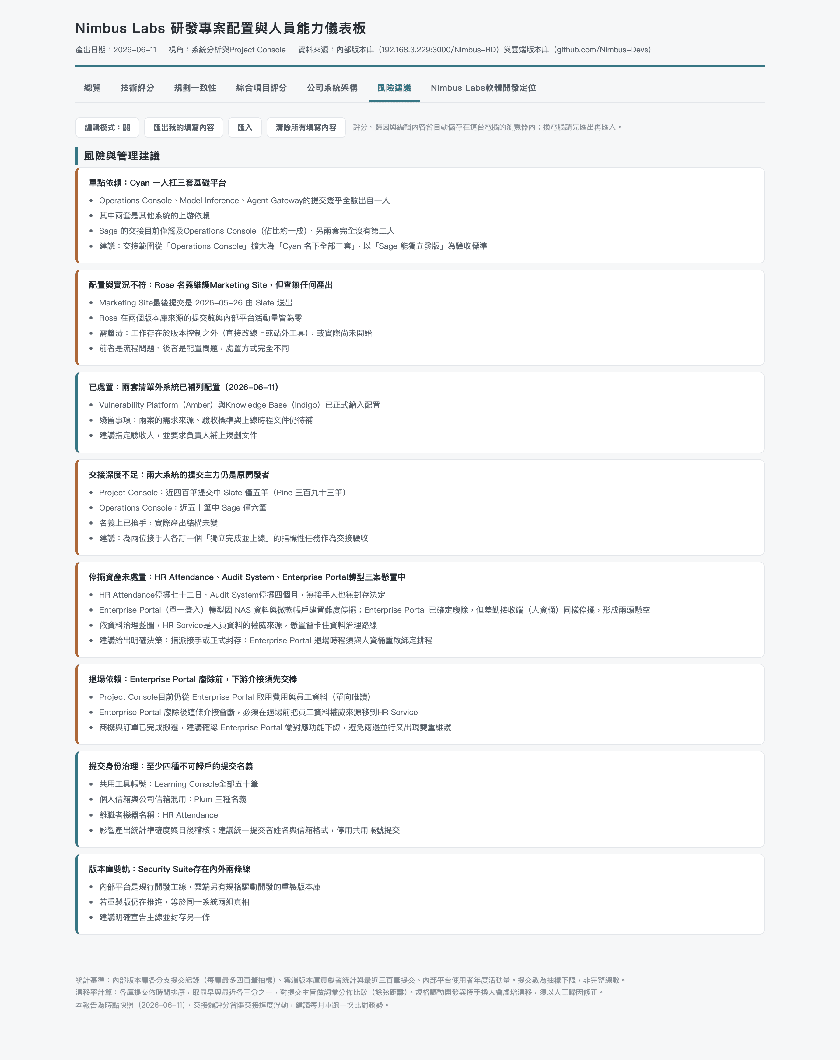
But beyond all of that, there is one thing the records alone will never settle: code quality, the trail behind defects, and the kind of project-level risk you only sense by paying attention.
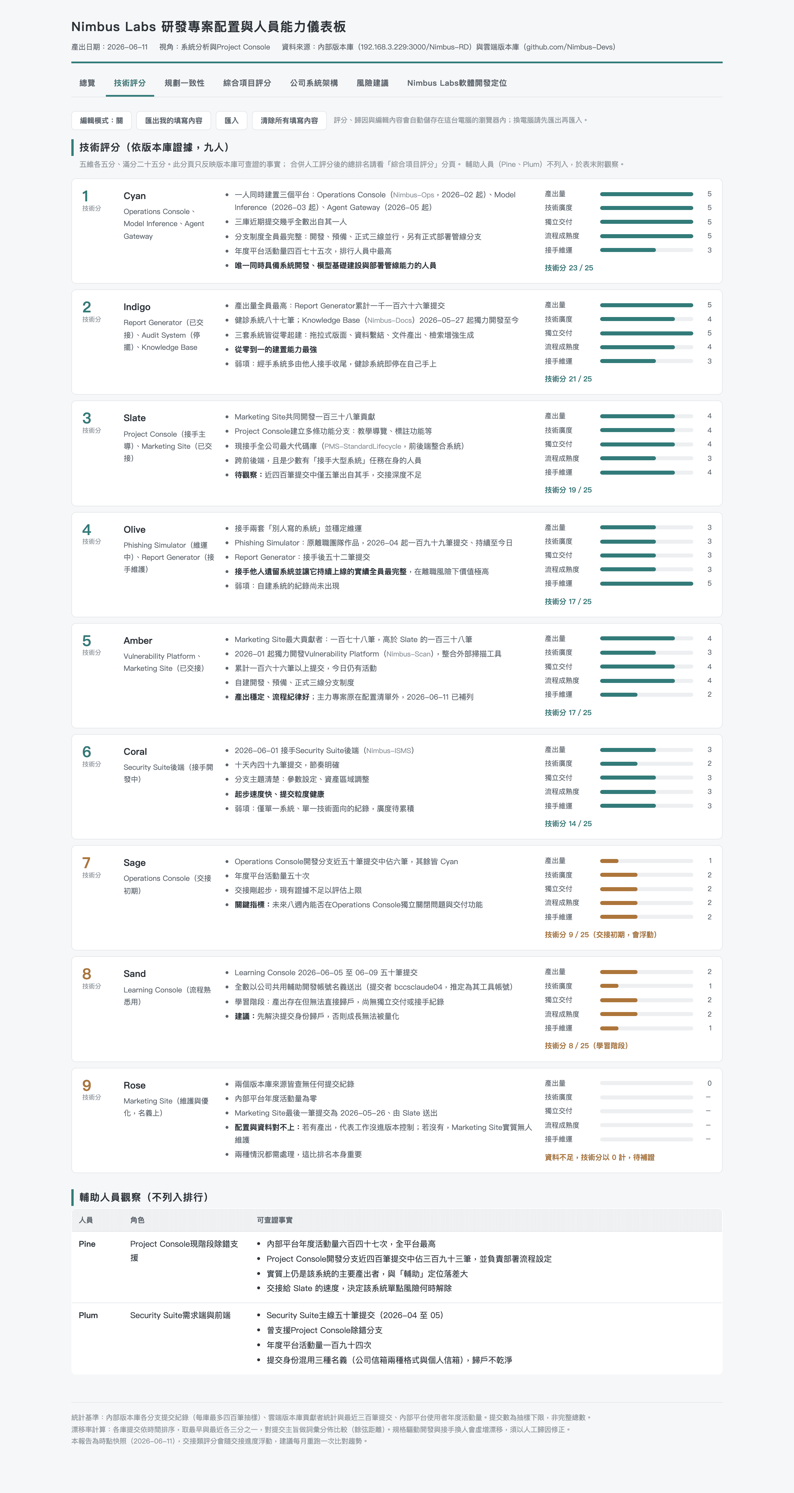
Five dimensions, 25 points each, for the human signals
Each dimension maps to something we can see in real situations — from understanding a requirement, through development, through cross-team collaboration. Initial scores come from work journals, day-to-day conversation, and meeting reports; those are then combined with the system's technical scores for a final read.
- Output volume — How much is delivered — but cadence matters more than total count.
- Technical breadth — How many different systems and layers of the stack they have touched.
- Independent delivery — Whether they can take a system from zero to live without hand-holding.
- Process maturity — Branching strategy, automated deployment, commit granularity.
- Handover capability — Whether they can pick up what someone else left behind and keep it moving.
Every dimension links back to its evidence; the score is not a black box. Disagreeing with a score? Argue with the evidence — not with the number.
There is a deliberate assumption behind this design: the most under-rated signal in any team is "handover capability". People who build a system from zero get noticed easily; people who can inherit somebody else's mess and keep it shipping tend to stay invisible. Team Canvas surfaces that signal — so the team doesn't discover the gap only when it's already losing someone.
A composite score, because the numbers alone are not enough
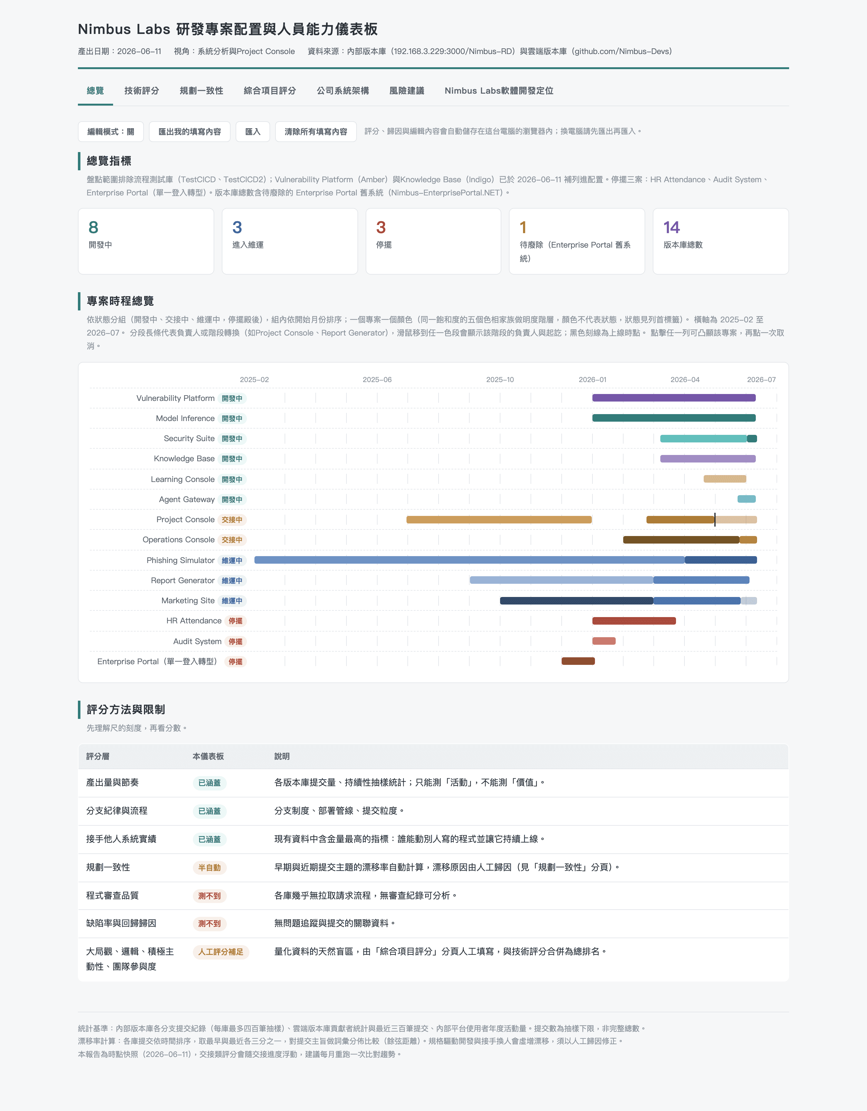
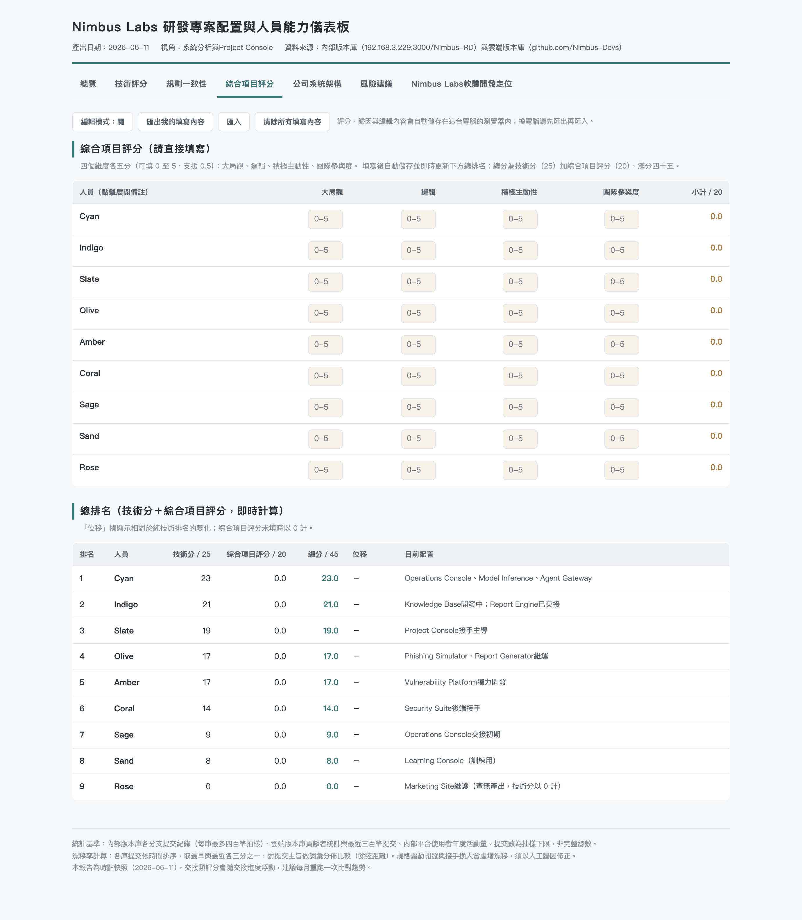
I put a simple, honest table at the top of the overview — what we can measure, what we can only half-measure, and what we cannot:
- What the data can measure — commit cadence, branch discipline, handover history. There is a trail.
- What the data cannot measure on its own — in an agentic dev environment, regular commits get marked as "on track" automatically — but the data does not show whether a person has a system-wide perspective or only knows their own corner, nor how they reason when they hit a wall, nor what they default to under pressure.
- What the data cannot measure at all — code quality (no review trail without a formal process) and how defects arose (no causal chain without issue tracking).
Which is why I built this next:
Six system states — and why "in handover" and "in maintenance" must look different at a glance
Every system in the org sits in one of six states:
- Active — owner known, shipping
- Maintenance — live but not evolving
- Handover — between owners — silent risk
- Stalled — owned on paper, not in reality
- Shadow — shared infra, no product owner
- Transforming — being repositioned
These six states must be visually distinct at a glance. The reason: "in handover" and "in maintenance" fail in completely different ways. Maintenance failures are gradual — there is time to react. Handover failures are abrupt — once the person walks out the door, the knowledge is gone. Making them look similar is how organisations end up reacting only after the point of no return.
What this gives the team
Team Canvas is not a tool. It is a mirror. It takes the things everyone "thinks they know" but has no data to back up, and puts them in the open. Who is on track and who might already need someone stepping in early. Where the timing across systems is, and who could take over or build next. Who is the right fit for handover and maintenance, and who has the temperament to build from zero to one.
By taking stock of skills and current system status, leadership has something concrete to align on around direction, positioning, model, and strategy. And — most importantly — work can be assigned so that what each person does actually fits them. People feel like they are growing, and like they belong.
Closing
Building this dashboard taught me one thing: when an organisation is about to introduce a new tool or a new process, the most important first step is not bringing in a consultant or a process expert. It is taking stock of what is actually happening now. And in the longer view, this canvas pattern can be used by other organisations and individuals as well — once they can plug in structured data from a source like GitHub or Gitea, they can run an initial diagnostic and an honest look at their current state.
Team Canvas's job is to get these things out of everyone's heads and back onto a single picture the team can look at together. It will not make decisions for you. But it will let "when did we start believing this?" become a question that, finally, has somewhere to go.